You don’t need another statistic to be convinced of the commonality of smartphones, but if you did, we’d tell you 77% of Americans are smartphone owners. On top of that, mobile devices dominate online minutes. That’s why it’s more important than ever that your website is responsive, meaning that your site responds by adapting its design for varying devices’ screen sizes. If your website isn’t tailored to meet user expectations on phone browsers, you can bet your bottom dollar that your web traffic is going to take a serious hit.
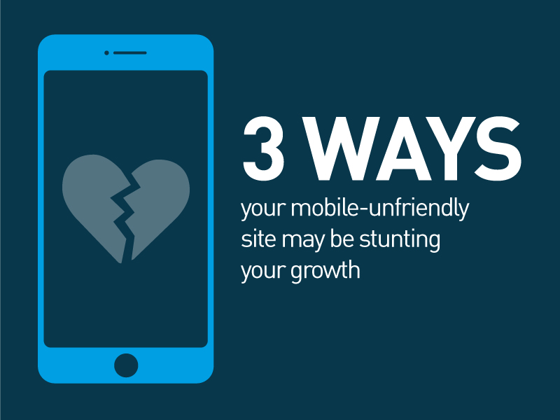
Here are 3 ways your website might be warding off visitors:
1. Content is hard to see.
You undoubtedly know the frustration of the monotonous “pinch and zoom” to move around a page that’s not designed for mobile viewing. The browser extends beyond the width of your screen, and you’re required to swipe across and over to read long lines of copy. No one enjoys this experience. And as annoying as it is for your users, it’s hurting your brand as well.
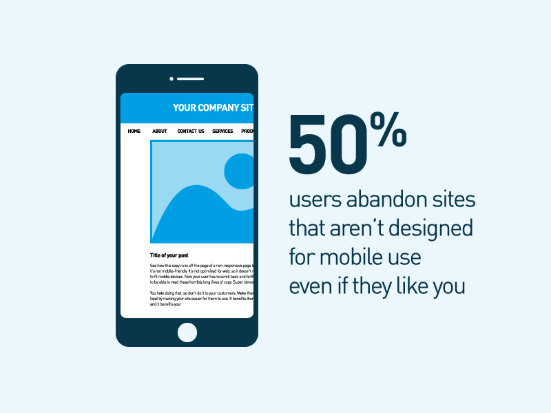
Half of users abandon sites that aren’t responsive on mobile phones even if they like the company (Mobile Marketing). By the same token, half of users said they wouldn’t do business with companies with non-responsive sites. Wonder why this lack of responsiveness is so offensive to users? Over a third who visit sites that aren’t mobile-friendly feel they’ve wasted their time. (While these stats are consumer-focused, they offer relevant insights for B2B companies.) The lack of ease immediately tells your customers that you don’t care enough to make your site accessible for them.
Enhance legibility. A responsive site is easy to see on mobile devices. Adjust type and image sizes. The size you use on your desktop computer doesn’t always translate perfectly to a smaller screen. Be critical of your content. Keep pertinent information top-of-mind for your visitors, and remove unnecessary secondary elements.
2. Navigation is poorly (or simply not) designed.
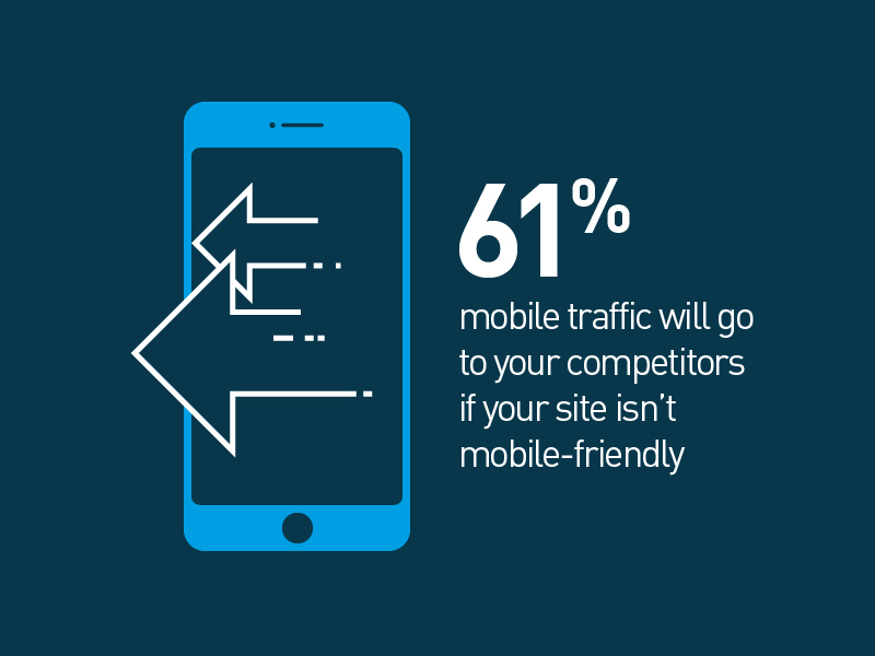
It’s one thing to teach your site to conform to different browser sizes; it’s another to boast a functional user experience. Companies without a mobile-friendly site can drive as much as 61% of their mobile traffic to competitors, but even with a mobile website, 57% of consumers will not recommend your business if your site is clunky and poorly designed (Mobile Marketing).
A menu that fills up the majority of a phone screen makes it hard for users to navigate your site. Images that fit well with the text on your desktop viewer can become disorganized on mobile screens if the usability isn’t carefully considered. Mobile viewing is a condensed experience compared to that of a larger monitor. If content is crowded and dense, or links don’t meet expectations, your visitors are going to duck out.
Investigate your user experience. Put your newly optimized site to the test by asking users, who match your target demographics, to scour your site for any stumbling blocks or pain points. An action that seemed clear from the creator’s perspective might not be interpreted the same for a new visitor. Be open to critique, as it is key to anticipating your users’ unique experiences.
3. Load times are too long.
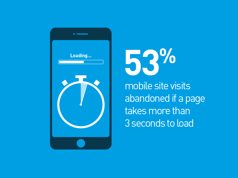
Over half (53%) of all mobile site visits are abandoned if the page doesn’t load within 3 seconds. THREE SECONDS. (Find this and more persuasive stats here.)
So, what’s hindering your load times? Two contributing factors:
1. Image/video assets
If your website is congested with unnecessarily large file sizes, it’s inevitable going to work harder to load the massive data. Evaluate your content, and take care of some cleanup if you have irrelevant, decades-old content, including ads, images, and videos, which are often responsible for site clogs.
2. Host service
If your website is housed on a shared server, you can lose control of how fast your site loads. Consider a dedicated server with a higher guaranteed speed. This option can be more expensive, but the additional cost may be worth it.
Cut out the clutter. Find your website’s “sweet spot,” and upload files conducive to web use. An easy solution: Export your images using Photoshop’s “save for web” function. A JPG file is your best option for optimization. Pro tip: Compress your image to its maximum dimensions on your site. This displays it at 100% rather than pseudo-shrinking a larger file in your site.
Creating a website is a monumental task, and optimizing it for mobile devices is an even bigger mountain to climb. Need help making your website mobile-friendly? We’ve been there. Whether you’re starting from scratch or migrating your current content to a responsive site, we’d love to help. If you’re not sure where to begin, we can evaluate your site analytics to discover how visitors access your content, whether it’s through a smartphone, tablet, or desktop. Contact us for a FREE consultation.
Take a look at two websites we recently redesigned and optimized for mobile use:
Académie Lafayette
PAR Electrical Contractors, Inc.