Clearwave Fiber Integrated Branding
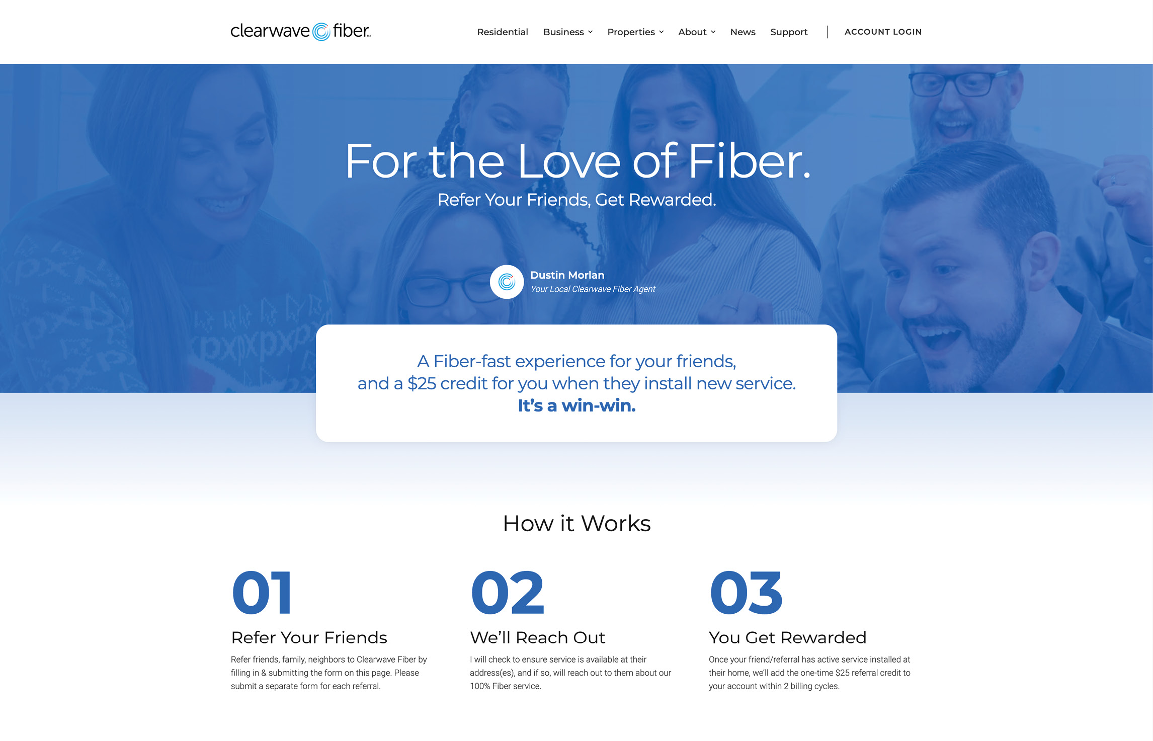
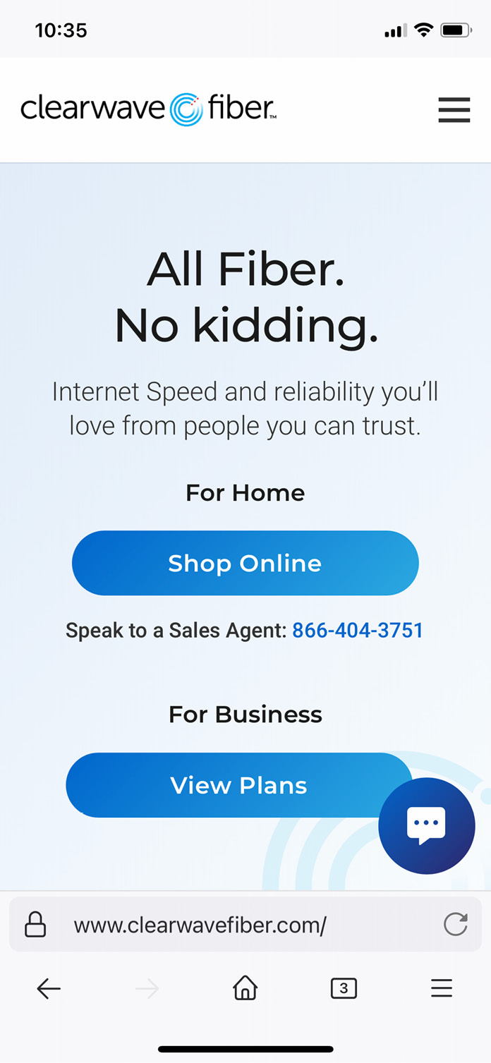
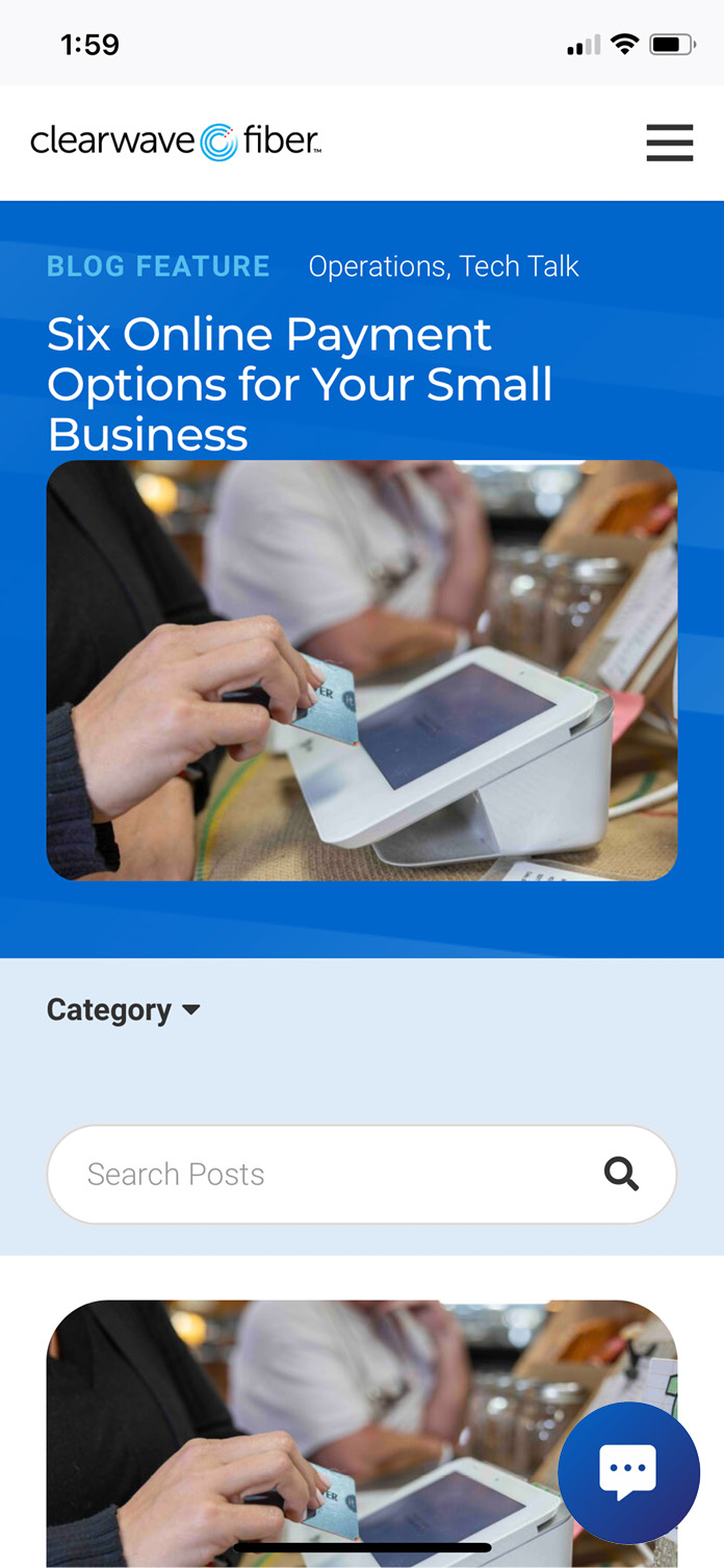
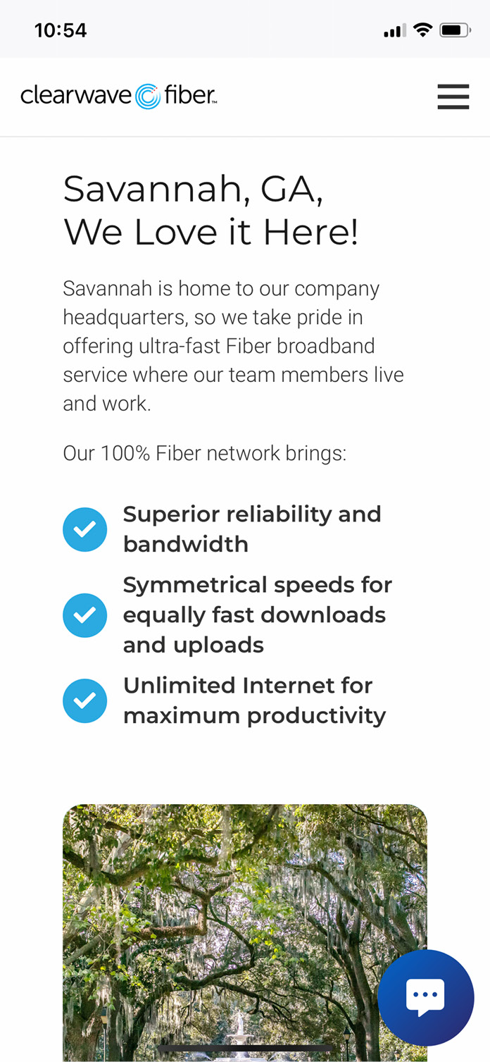
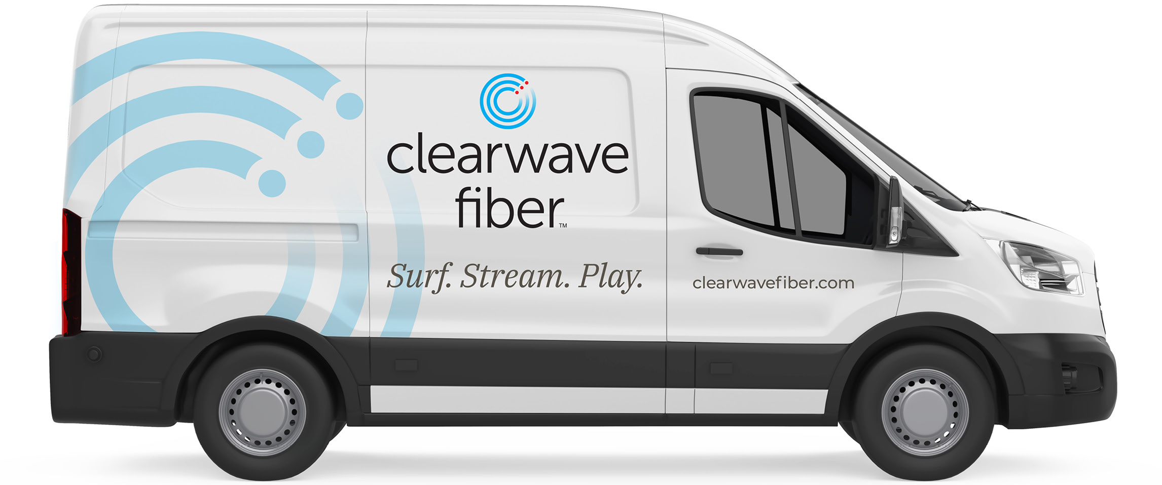
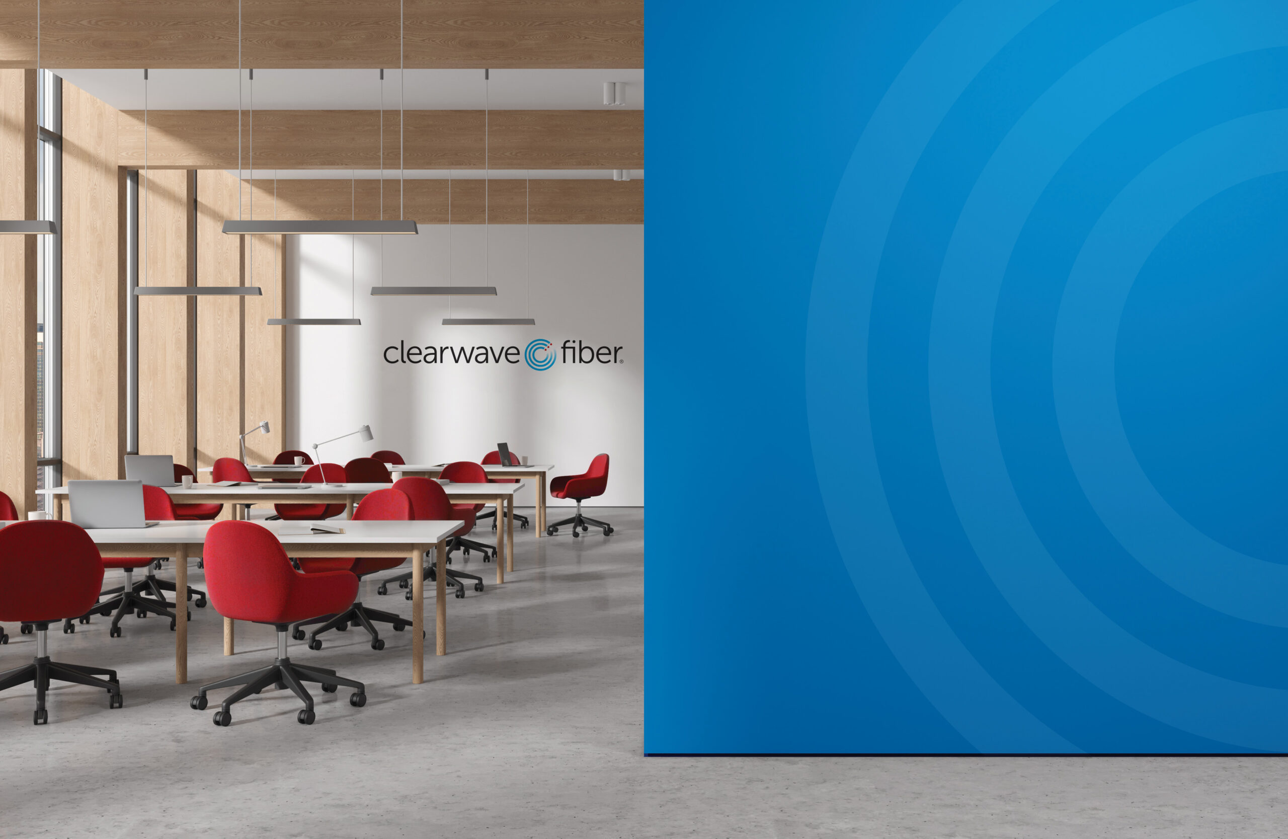
Our work with Clearwave Fiber, a regional Fiber Internet provider, started with a logo refresh and microsite. Our partnership has since grown to encompass integrated branding campaigns including a brand guide, environmental graphics, vehicles, and a greatly expanded site serving a variety of residential and commercial audiences.
Integrated Branding
Brand Identity
Website Design

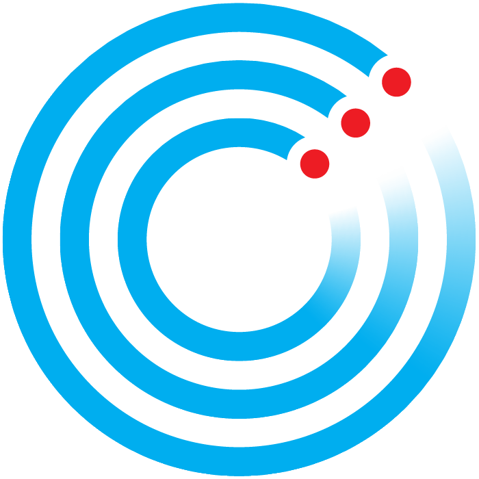
The Clearwave Fiber logo contains a “Fiber C” letter mark that represents the delivery of communications through fiber optic lines. The gradient blur represents speed, the circular shape represents continuous communication. The letter C is a reminder of the brand name. The three red dots represent the data running through our fiber optic lines.

We take your Internet experience seriously.
We’re dedicated to delivering the finest technology, installed and serviced by folks who live and work in your community, at a straightforward, no-surprises price.
We won’t settle for less. You shouldn’t either.


